hidden
./PRI brand and asset management./

./Branded assets accessible everywhere
The challenge
A general lack of consistency was noted in the most frequently used assets throughout the organisation, such as Word documents and PowerPoint presentations. This inconsistency placed a heavy burden on the design team, as we were tasked with addressing both stylistic and substantive issues in a condensed timeframe. Upon review of our internal practices, it became also apparent that a majority of our PowerPoint decks were burdened by an excess of copy/text. This issue limited presenters' ability to effectively convey their message and engage their audience, thereby hindering the success of our presentations.
The solution
By recognising these challenges, I developed strategies to streamline the creation of these materials and reduce the strain on the design team, resulting in improved efficiency and a more cohesive brand image across the organisation:
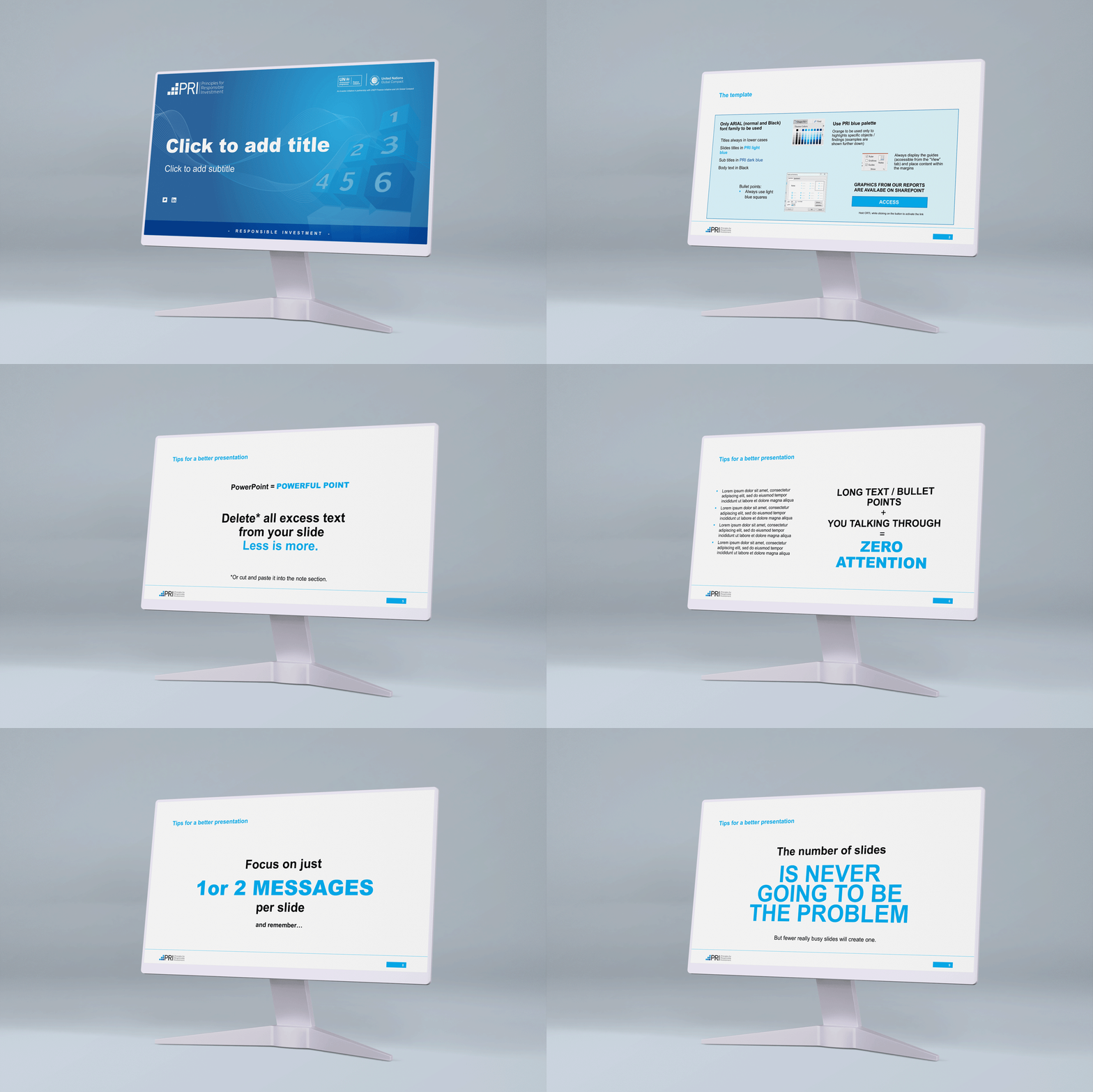
- Created series of Word and PowerPoint templates for our different offices and business units with pre-populated styles in line with our brand;
- Implemented and synced the templates with our Microsoft 365 accounts;
- Created a series of training videos both on technical/stylistic and content-creation aspects;
- Isolated and trained key members of staff company to act as "champions" of their teams;
- Worked with HR on making both templates and instructions part of the induction/onboarding pack for new hires;
- Specifically to PowerPoint, incorporated a series of instructions on both styles and content within the template and created pitch decks for each team, explaining who they are and what they do, for both internal onboarding (new hires and/or new clients).
The outcome
The benefits of having a Microsoft 365 synchronisation was two fold, it allowed staff to easily access our templates regardless of their location or device, and allowed us to effectively roll out updates in one convenient place, therefore avoiding duplications.
The burden on the design team' was greatly reduced as our involvement was limited to the creation of specific assets and general quality check. As a result, we were free to use our skills and time for more strategic and high-level presentations, like sales pitches .
Content creation teams felt involved and gained a sense of satisfaction in creating a more professionally-looking document by themselves.
We experienced a notable increase in audience engagement rates during both live and digital presentations and events. The organisation has widely recognised the value of this new approach, with many noting its positive impact on our ability to attract new business, particularly for our online training unit. Additionally, this approach has enhanced our teams' ability to seamlessly integrate and present documents from disparate sources, ultimately leading to more cohesive and effective presentations.
"Once again, Ale has worked his magic!
The Pitch Deck he created for us is an example of professionalism. The quality of the design is top notch and the content is far more digestible than before. It has increased our confidence during meetings and we are now able to make a more compelling case to potential clients, resulting in greater success rates."
- PRI Academy team
./Developing the PRI brand
PRI's brand visual identity
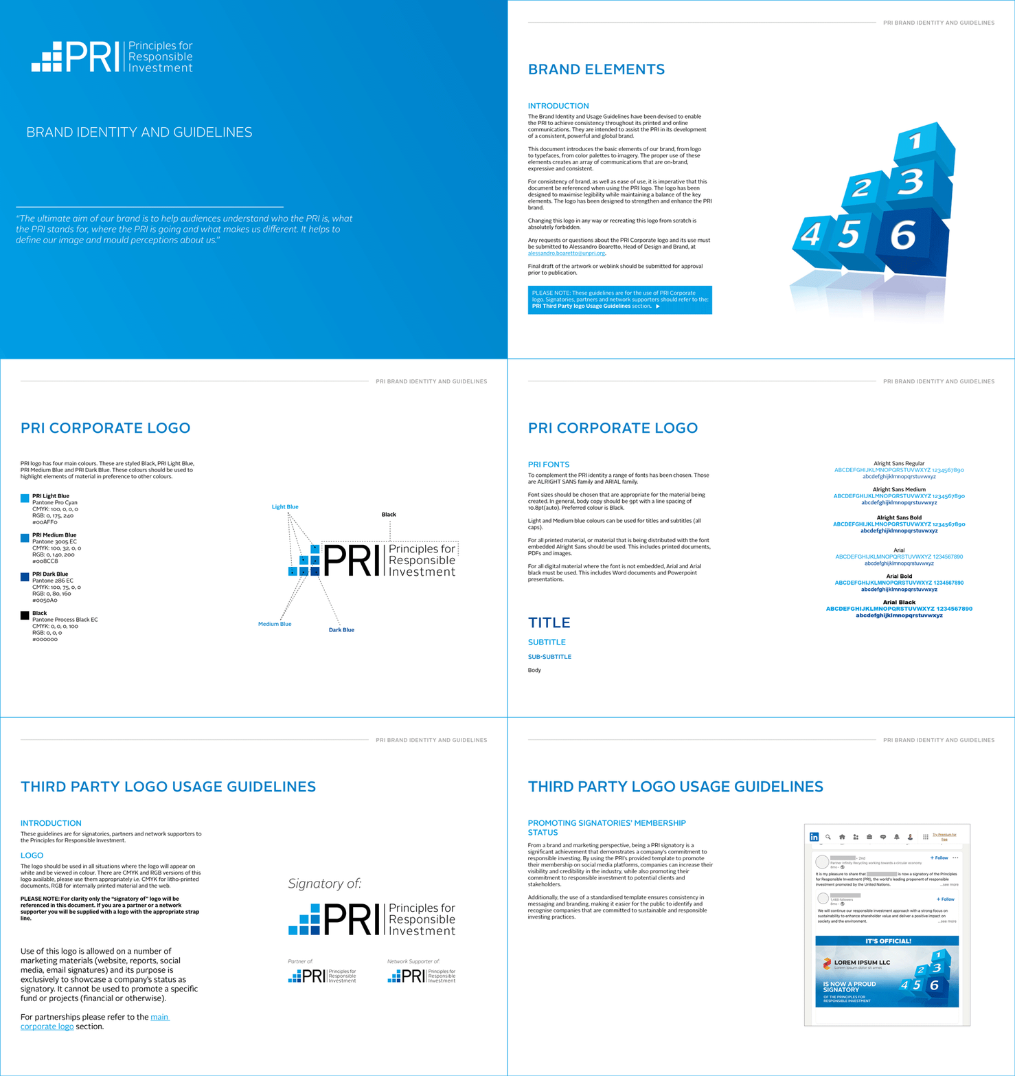
During my tenure at the United Nations-supported Principles for Responsible Investment (PRI), I led the development of the organisation's brand visual identity from both an internal and external perspective. To ensure consistency across all platforms, I formulated comprehensive brand guidelines and design principles.
To manage logo use requests for external events and initiatives, I designed a form that was shared with requesting companies. I implemented a rigorous quality check exercise to ensure compliance with our brand guidelines, and all requests were logged and stored centrally for upper management's review.
In addition, I created comprehensive packages for our signatories to showcase their membership, complete with instructions on how to properly use our third-party logo and a communication starter pack containing tailored assets for Twitter and LinkedIn.
PRI's sub-brand visual identities
My role also included the creation of sub-brand visual identities for various projects, initiatives, and events under the PRI umbrella, such as PRI in Person, our annual global conference, and PRI Digital Forums, our 10 years anniversary celebration project, as well as business units including the PRI Academy, our online responsible investment training subsidiary.
By actively collaborating with both internal and external stakeholders in incorporating their feedback and vision, I ensured that each brand identity was aligned with the overall PRI visual identity and effectively communicated the intended message.
"Alessandro was critical to building the brand and ensuring that the PRI had a distinctive look and feel. Alessandro had to work to demanding deadlines and always delivered high quality work."
- Fiona Reynolds, former CEO, PRI
./Streamlining our in-house production
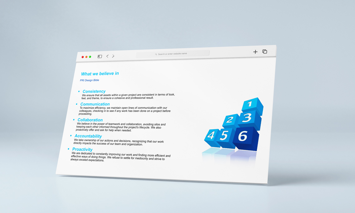
Recognising the increased demand for design-related assets and the corresponding need for consistency as our team grew, I spearheaded the creation of a centralised list of assets, templates, specs & instructions and collected them in a living document I called Design Bible, which also contain our Design Principles and values.
This initiative allowed me to streamline our asset creation process and maintain a consistent brand identity, as our team grew. As a result, our team was able to more effectively manage the growing workload, while maintaining a high level of quality and consistency across all design assets, and it has been an invaluable asset both internally and when working with external agencies and freelancers, which in turn, helped reducing the number of interaction and therefore reduce cost and timings.
By involving all team members in the process, I was able to foster a culture of collaboration and shared ownership, resulting in a more cohesive and motivated team.
"Thanks to this document, our guesswork has been greatly reduced, we are more clear on the asks and we are able to produce assets quickly and with the right specs. I wish more of our clients were this organised!"
- Feedback from our freelance agency
./Takeaways
The implementation of streamlined processes and the development of a Design Bible have significantly contributed to maintaining a consistent brand identity and improving the efficiency of the design and communication teams.
The use of Microsoft 365 templates, training videos, and the appointment of "champions" have reduced the burden on the design team while increasing content creation team satisfaction.
The successful implementation of these strategies and initiatives highlights the value of structured approaches to improve efficiency, productivity, and consistency across organisations.