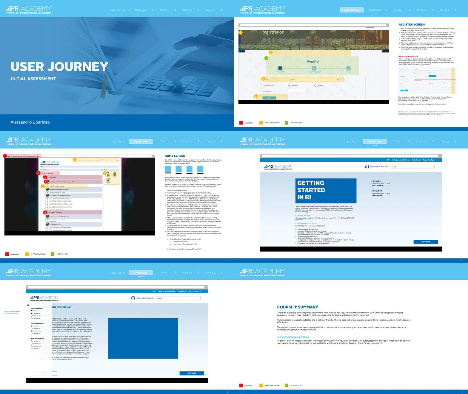
Initial assessment - Summary:
There are numerous inconsistencies between the main website and the actual platform. The dashboard looks really outdated and is not user friendly. There is a need to prioritise functions, and get rid of all excess of content. Throughout the course we have imagery and charts that can use some revamping and also make sure to have consistency in terms of style, animation and colours with the PRI brand.
Next steps:
To collect all users feedback, start working on affinity/user journey maps and then start putting together a series of wireframes to be tested, signed off and tested again, before being sent over to developers."