./Brent Cross Town Flourishing Index./
My belief
Complex data has value only when people can understand and act on it. Good design can turn evidence into an accessible story—helping us measure not only what a place is built from, but how it supports people to live, connect and flourish.
"The concept of using a scientific dataset to gauge flourishing is absolutely brilliant. We all carry our own notions of what well-being looks like, but without a more objective approach, it's easy to default to personal biases. Therefore, making decisions based on solid evidence is a real game-changer."
Kunle Barker, Placemaker, Writer, Broadcaster, on the Flourishing Index methodology
./What is Brent Cross Town?
Brent Cross Town (BXT) is one of the UK’s most ambitious regeneration projects; a public-private partnership between Argent Related and Barnet Council.
The Flourishing Index was conceived as a new way to measure success - not by GDP, employment indicators or living standards, but by how people feel and function in their daily lives.
The vision? To create a “non-corporate” report that allows readers to fully digest the information presented.
It’s about shifting the narrative from “me” to “us,” and building a community where wellbeing is not just a goal, but a measurable outcome.
The challenge
Argent wanted to present the findings from the 2022 baseline report in a way that was engaging, accessible, and visually rich.
The final report was due to be launched at a public event in early June 2024.
Additionally, this was a live, evolving document. The report was still being edited while on the design phase, which meant we had to work in parallel with the content team. Flexibility and communication were key.
Criteria
- Investors-facing first, public second
- Minimal text, maximum visual impact
- Each page as a standalone piece
- TLDR (Too Long Didn’t Read)
- Designed to be “fun” and easy to browse
The Solution
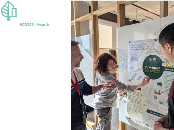
We began with a series of collaborative workshops to understand the client’s vision and expectations.
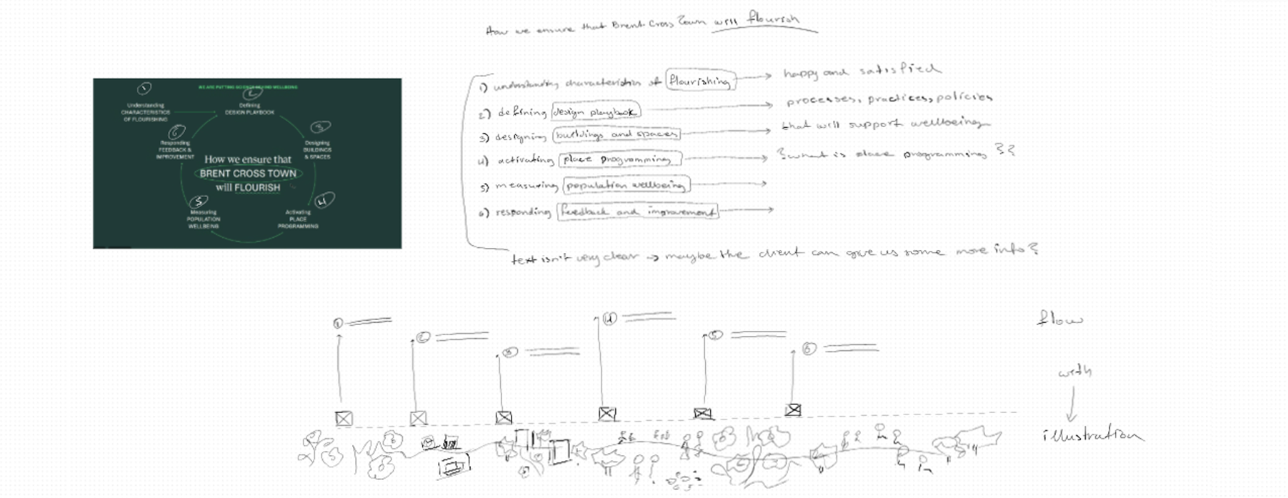
We set up an detailed action plan mapping milestones against tasks and team's strengths and availability.
One of the first challenges was the structure and tone of the original draft - it was dense, academic, and not aligned with the intended audience.
We broke down the copy, mapped it against the client’s notes, and explored how we the text could be broke down and reduced, while being conscious of all the insights presented.
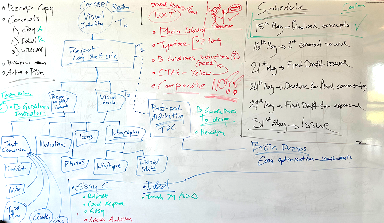
VC team Action plan

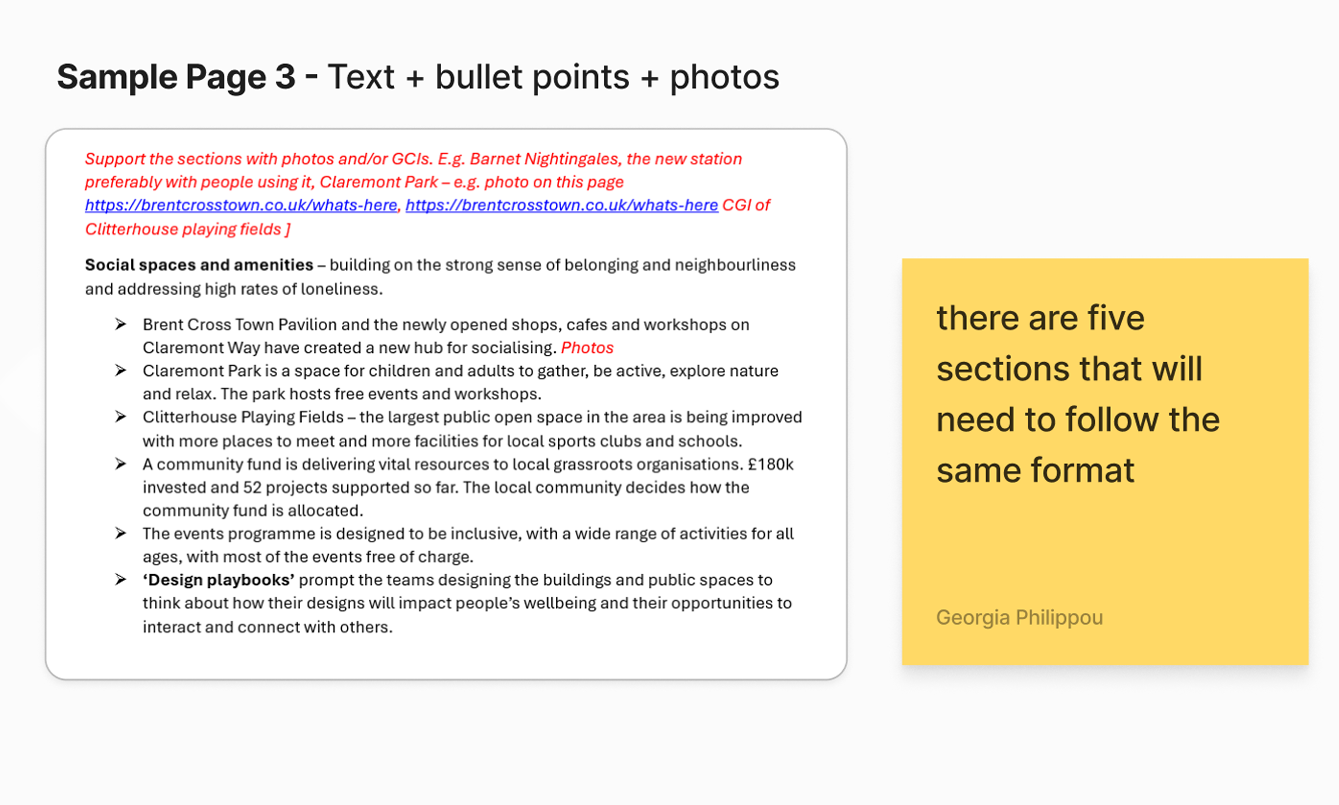
Initial copy breakdown and hierarchy setting
Crafting the story
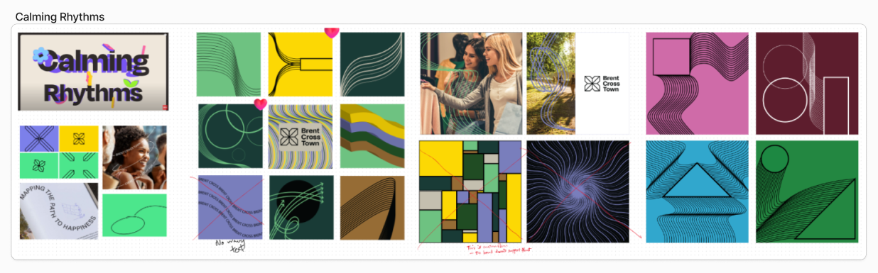
We explored three creative directions based on the brief
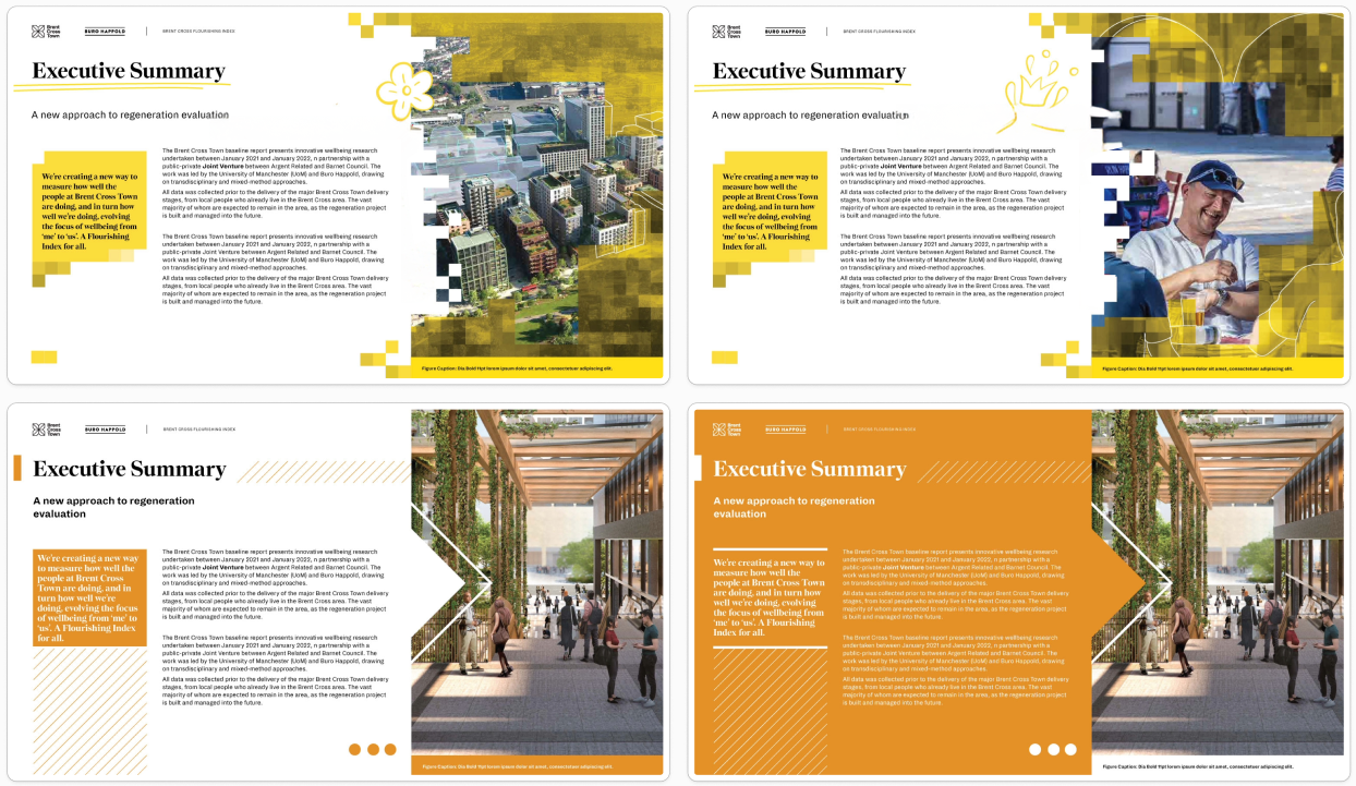
Safe: Non corporate geometric
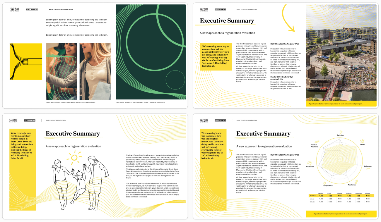
Ideal: Calming rhythms
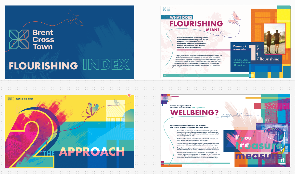
Wildcard: Kaleidoscopic nature
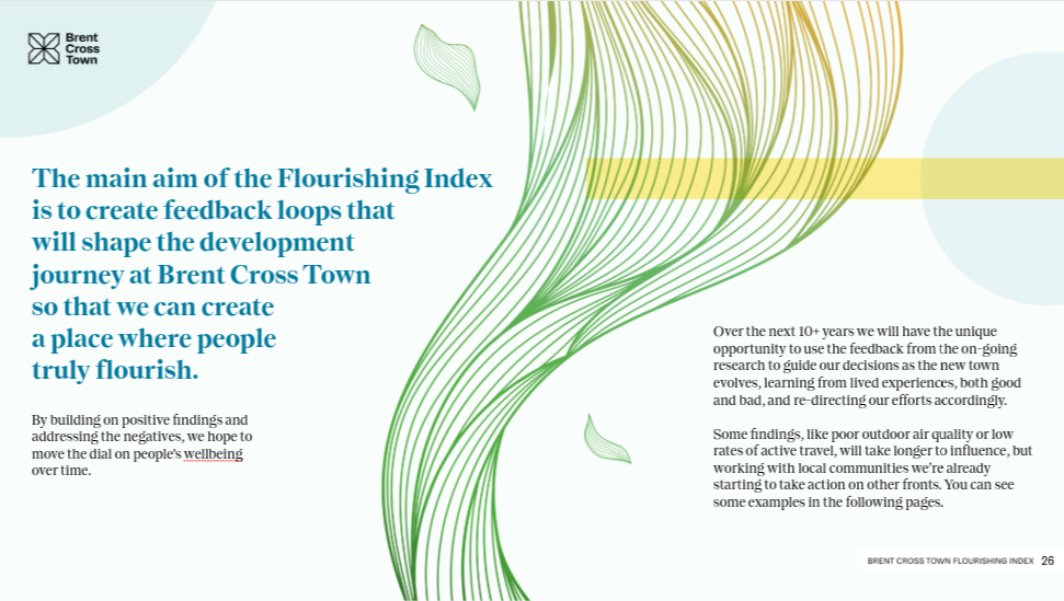
The client aligned on “Calming Rhythms” - a soft, flowing aesthetic using natural forms, undulating lines, and inspired by nature, indicative of an inclusive environment.
Solution Development
We chose to build the report in Adobe Express - a bold move, given it was a relatively new platform with limited precedent for long-form, graphic-heavy documents. But it offered the collaborative flexibility we were after.
Challenges included: Learning a new platform on the fly Navigating its limitations for layout and asset management Balancing creative ambition with technical constraints
- Learning a new platform on the fly
- Navigating its limitations for layout and asset management
- Balancing creative ambition with technical constraints
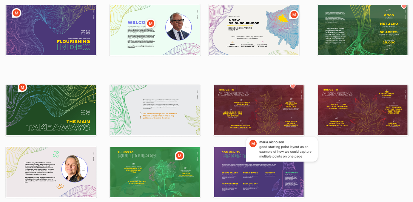
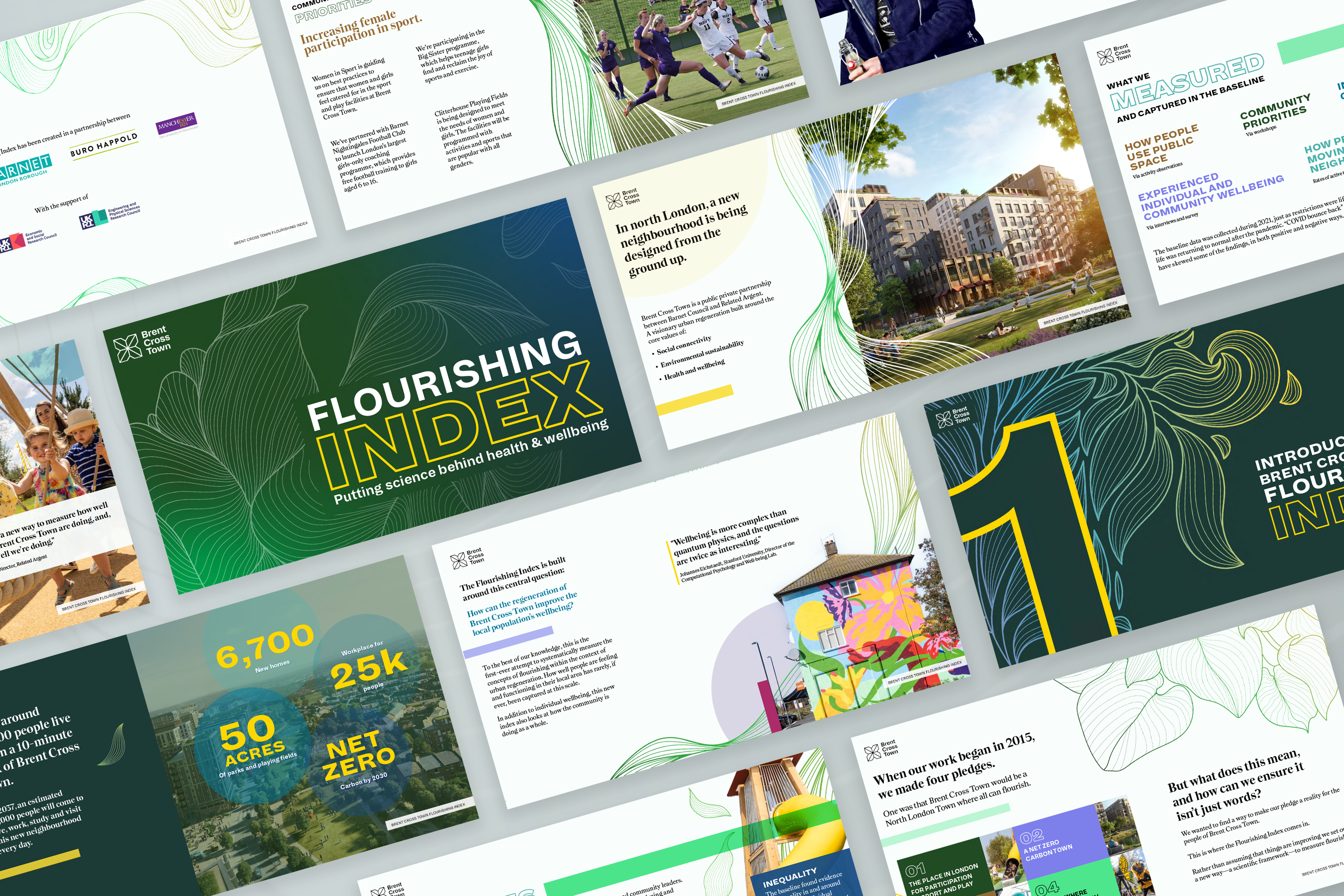
We blended stock assets with custom illustrations to create a cohesive visual language while treating each page as a standalone piece.
"This concept represents our commitment to delivering a creative and engaging document that is energetic, concise, and most importantly, reflects Brent Cross Town and its community."
Visual Communication Team
Implementation
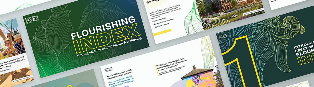
With a great collaborative effort using our teams processes and techniques, we developed out the final result. Our team tackled layout, structure and developed the final graphics.
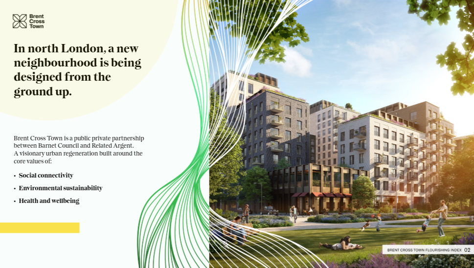
One further challenge came late in the process: a shift in the colour palette, due to a late senior key client stakeholders involvement in the design development. As a result, the client requested a move toward a more nature-inspired spectrum - greens, blues, and neutrals. This required a full audit of the visual assets and a rapid redesign of several spreads.
Despite the pressure, the team responded with agility and care - ensuring the final product felt cohesive, intentional, and beautiful.
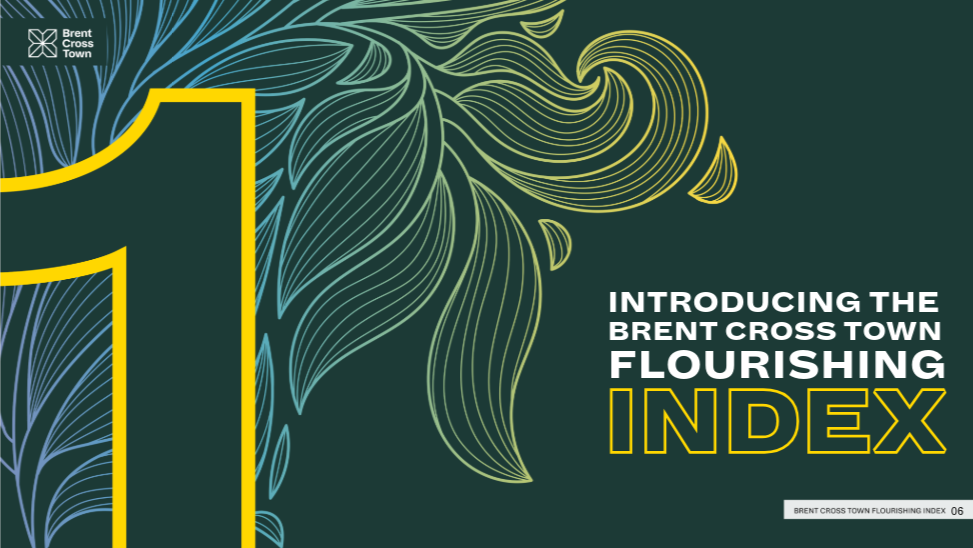
Revised design based on the new colur palette (green, blue + Brand accent colour)